Logo designs
Existing Logo designs
This is a logo for a business card. The logo is small and effective which is perfect for a business card. The colour gold stands out a lot with a black background. It is also a unique colour as not many companies use gold for a logo. They have made something simple and made it look very effective. The company isn't very well known itself so it is surprising that a small business could have this design turn out so well.

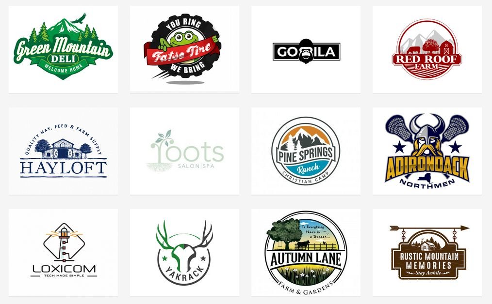
Here is a collage of 12 different logos. The logos are advertising local businesses. They aren't as appealing as the other logo however they are still effective. They have clearly took time in designing the background as it resembles the area where the business is based. Therefore this would be a nice touch for the people who are from that area to have a landmark on the logo that is local.
My Logo
Here is an example of what I experimented with in order to create my logo. Before I designed my logo I was very inspired by the first example. I really liked the colour of the initials as I was sticking with the gold on my logo as I really liked the look of the gold. I'd prefer to maybe to have the initials a little stretched as I am not really a fan of the chunky letters.
In order to finish the overall design of my logo I had to create a suitable background for my logo and I decided a black background will definitely work best with a gold logo. I know this because of the existing logos I have looked at and analyzed. The black background will help the gold letters stand out and be more appealing to the client.
Logo Design Feedback
I created a google form so I could gather feedback from the people in my class for my business logo. I asked 3 questions about the logo. I asked what is good about the logo, what could be better and a score out of 10. I added these questions as it covers the aspects of what I have done well and I could easily understand what I could've done better.


.png)
.png)

.png)
.png)
Comments
Post a Comment